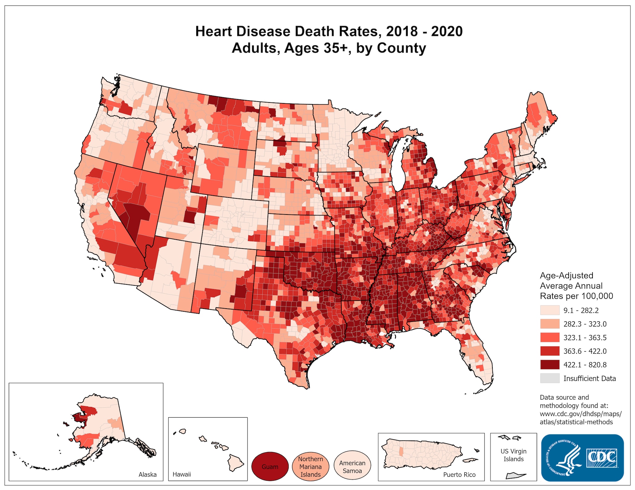
The map shown above is a Choropleth Map. These maps are an example of a thematic map which shows different shades in different areas to show statistical value within the map. This map portrays Heart Disease death rates in adults 35 and older from 2000-2006.
No comments:
Post a Comment